Last year, I took my first steps in science-fiction production design. Having been both a set designer and a sci-fi nerd for many years, I had always wanted to shape the visual identity of my favourite genre (and had no shortage of opinions on how to do it!).
Prior to this sci-fi production design role, I had come from set design for a play called Deposit, in which I recreated a cluttered London flat on stage. No set changes allowed my entire budget to go into it, and it became the most detailed set I have ever created. One week before opening night, unfortunately, COVID was declared a pandemic and Deposit never made it to an audience. But the experience of designing that cluttered flat aligned with my taste in sci-fi, and from it arose a vision of a lived-in future.
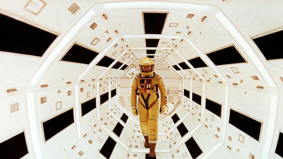
As I explained to the director of Of Her Time – the sci-fi play for which I created a visual identity – futuristic production design is too often pristine, and it’s difficult to believe that characters really occupy their world. A perfect white spaceship without a hint of clutter as home to a crew of human people? I don’t buy it. The juxtaposition of such an aesthetic with one that reflected the humanity of Of Her Time’s characters embodied my approach and – fully bragging here, but I did work exceptionally hard on this – the result was described by one reviewer as ‘phenomenal’.
[Of Her Time’s] costumes were phenomenal, with the colour schemes matching the sets and tone of the play. Many of the black, white and grey costumes supported the futuristic sci-fi genre, and the colourful outfits that were worn portrayed the peppiness of the characters. The sets were simple but just enough – they provided the perfect amount of information creating a setting that was relevant but not distracting.
Rothery Sullivan (Glasgow Guardian) on the production design of Of Her Time
I’m far from trailblazing with this idea. Although it has earlier origins, the Used Future was popularised by George Lucas in his iconic 1977-1983 Star Wars trilogy. Even those uninterested in Star Wars would recognise the Millennium Falcon, fastest ‘hunk of junk’ in the galaxy and, likely, the most widely-known example of the Used Future.

To me, among the greatest imaginings of the Used Future is Firefly, a 2002 space-western that ran for one season before its untimely (and undeserved) cancellation. It isn’t a perfect show, but its unique vision of the Used Future is one of science-fiction’s strongest.
Space-westerns have an intriguing visual identity by nature – the futuristic elements of sci-fi exist in opposition to the spaghetti western aesthetic. Marrying the two infallibly results in something unique. This phenomenon isn’t limited only to live-action – Cowboy Bebop, a 1997 anime regarded as one of the decade’s best, unites the conflicting space-western elements almost seamlessly, leaving just enough doubt for a layer of unexpectedness; it seems both inventive and completely natural that a man named Spike Spiegel should fly around the galactic Wild West in a spaceship.
Firefly and Cowboy Bebop are both somewhat niche examples, but with the advent of Disney+, casual viewers are more familiar with the space-western genre than ever. The Mandalorian can especially be credited with bringing it to the mainstream.

The Used Future has never been a novel concept in space-westerns, but step into the wider realm of sci-fi, with its pristine white spaceships and shiny chrome, and it becomes far less ubiquitous.
The overuse of perfect, white, chrome, shiny, clean in science-fiction is so prevalent that it was parodied in popular cartoon SpongeBob SquarePants. SB-129, an episode which many of today’s 20-somethings credit as their first encounter with existentialism, sends Squidward to a future where everything is made of chrome, not-so-subtly poking fun at the sci-fi trope.
But let’s board that shiny white spaceship, and look at one of the most popular sci-fi movies of the pre-Star Wars (and pre-Used Future) era: 2001: A Space Odyssey.

My Design & Technology class watched 2001: A Space Odyssey together, and I found myself simultaneously impressed and underwhelmed. Shiny white spaceships, indeed.
I am not going to argue that 2001 lacked a strong visual identity. It simply lacked a visual identity to which I could find any reason to connect. As I’ve grown into the production designer I am today, I’ve come to identify with one particular tenet: the visual identity of a production should be honoured with at least as much as depth as the story and its characters.
Recently, I borrowed a book from the library. Nausea by Jean-Paul Sartre, old and loved and worn. Every few pages, some reader from days or months or years past had highlighted a passage. I could see their hope in bright orange over protagonist Antoine’s feeling that his world of stagnation wanted to change. Their loneliness found company with mine in fluorescent pink across his accounts of solitude. This nameless, timeless reader, through the anonymity of a pen and a borrowed book, whispered I was here.
And that’s it, isn’t it? We leave our marks on our world, and we connect with those left by others. It’s the hand of a teenage boy over that of an ancestor through a cave wall painting. It’s the first person to see a sunrise from space scribbling the scene onto paper to give others the same view. It’s the highlighted passages of a reader long-gone, being relived through the next person to pick up the book.
When production design doesn’t reflect that, it deprives itself of humanity. In the shadow of Kubrick’s philosophical message, 2001 has no connection to the life at its core. Production design has so much power – with enough care, it can express character, story, and setting with profound eloquence and depth.
Before a single word of exposition in Firefly, its visual identity allows you to understand the future it depicts. You know what kind of home Simon and River Tam grew up in from one shot of their childhood living room. You see the contradictions of Inara’s life play out across the extravagant décor or her room.
A richness of experience forms when production designers are not afraid to embrace the marks we leave on our world. When it comes to science-fiction, this visible evidence of humanity grounds a far-fetched future in the relationships we have to each other. The Used Future is, at its core, an expression of empathy.
I give the Used Future five stars.


Leave a Reply