In every Disney World park, there is a Starbucks. Also in every Disney World park, there is no thematic reason for a Starbucks. So, while this article may have been conceived as a sort of April Fools joke, it became a genuine exploration of how Imagineers make the ordinary look at home in extraordinary surroundings.
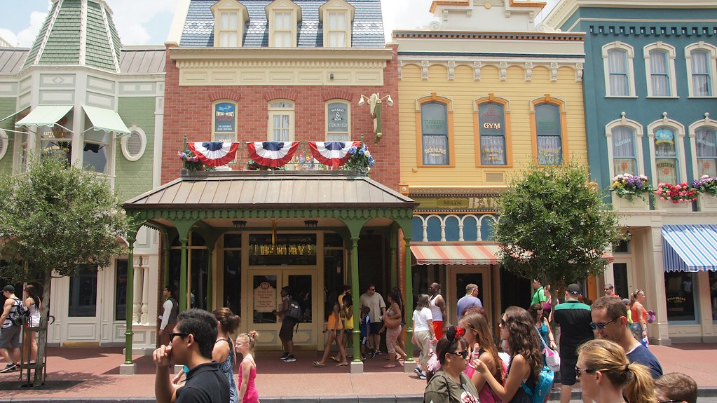
Main Street Bakery – Magic Kingdom
Main Street, a staple of Disney parks around the world (under various names), pays nostalgic homage to the small-town America of Walt Disney’s youth. Author Richard Snow describes Main Street as a ‘triumph of historic imagination’; it romanticises its subject matter so flawlessly that it feels like a living childhood memory, no matter where or when you grew up.

Main Street has curated Queen Anne architecture into an idyllic collection. Storefronts wear colourful awnings like crowns and extend upwards into ebulliently decorated apartments. Horse-drawn trolleys and vintage vehicles carry parkgoers on leisurely tours past every charming building.
Such exuberance is not the natural habitat of a Starbucks. Our image of the popular coffee brand involves bustling street corners, the nonstop lifestyle of modern city-dwellers, and all things antithetical to Main Street’s romanticised vignette of early 1900s America. With no way to nestle a typical Starbucks into the environment, Imagineers had to go to considerable lengths to make it seem at home.

On the outside, there is no modern Starbucks branding. Even the name acts as a buffer between the world of Main Street and the coffee chain within; its official title is Main Street Bakery Featuring Starbucks Coffee, and is known to most Magic Kingdom guests simply as Main Street Bakery. Bright Starbucks green has been traded in for sweet pastels, until stepping inside, where today’s Starbucks colour scheme is gently introduced to the vintage aesthetic. It’s the same technique used in queue areas to transition guests into an attraction’s fictional setting.
Externally, the only evidence of Starbucks is a small hanging sign and a logo in the window – and even these have been carefully designed to protect the vintage atmosphere. In place of today’s iconic green logo, Main Street Bakery uses the oldest version of the twin-tailed siren. It is one of the only Starbucks locations in the world to keep the original logo.

Born from the romanticism of a childhood memory, Main Street is an idealised imagining of small-town America. The phenomenon of modern-day coffee chains lacks a natural place among its flawless facades, but under the disguise of Main Street Bakery, Imagineers have seamlessly hidden Magic Kingdom’s Starbucks. Through careful alteration of colour and branding – even using decades-outdated Starbucks signage to add vintage credibility – the coffee shop lives in harmony with Main Street’s turn-of-the-century ebullience, and serves as a lesson in immersive design.


Leave a Reply