There’s a lot of magic in The Wizarding World of Harry Potter at Universal Orlando.
The snow-covered rooftops, the ‘real’ magic wands, the moment you step through that archway into Hogsmeade and see Hogwarts over there in the distance, beckoning you closer, making you forget that you were ever anything but a wizard in snowy Scotland and-
Okay. You get it. I like The Wizarding World of Harry Potter.

But, today, I’m not going to talk about how captivating the snow-covered rooftops are, or the genius of the magic wands, or the use of practical effects to bring the fantastical to life. I’m not even going to talk about the world-class ride experiences or the technology that makes them possible. I’m going to talk about the bits in between. The bane of every theme park guest’s existence. The necessary evil.
I am, of course, referring to queues.
When it comes to theme parks, queues are unavoidable, and guests don’t leave them behind when they make it to the front of the line. The queue lingers. Whatever emotions a guest leaves a queue area with are the ones they take onto the ride vehicle, colouring the lens through which they see the experience.
Good theme park design does not leave those emotions to chance.
Imagine queuing for The Simpsons Ride and then immediately boarding Transformers: The Ride 3D. Would the high-intensity action of Transformers feel as convincing after the light-hearted, colourful queue area of The Simpsons? Would the fun moments stand out more than the dramatic ones?
These are the sort of questions that theme park designers have to ask when creating a queue area to complement a ride. Of all the queues from Universal Creative, Harry Potter and the Forbidden Journey is the one to answer these questions most eloquently.

Built for extremely long wait times, Harry Potter and the Forbidden Journey’s queue area – an immersive recreation of the corridors and classrooms of Hogwarts – is big enough to guide guests into more than just one emotional note. As guests move from room to room, they are pulled towards the mood of the attraction, so that by the time they board the ride vehicle in the candlelit great hall, the mysterious aura is tangible.
Think I’m talking nonsense? You should. The manipulation guests experience in the queue area isn’t supposed to be consciously noticeable, but if you know what to look for, you’ll see it in almost every queue.
Notice the way the lighting changes in Forbidden Journey from bright sunlight to golden lanterns, to cold twilight filtering through the frosted windows of a classroom, and then to only candles in the foreboding dark. It’s not a coincidence that the colours begin with lively green that gives way to golds and browns, which slowly darken as blue is introduced a third of the way in, then deep red at two thirds, before bringing in the darkest browns at the very end. If you’ve never been through Forbidden Journey, take a look at a video of the queue and I bet that it will be enough to tell you what sort of ride it leads to.
Harry Potter and the Forbidden Journey might be the most intricate example of a queue area guiding guests through moods and atmospheres, and it’s difficult to imagine how something so abstract was designed. To obtain a clearer understanding, it is often helpful to venture into the history of theme parks, where a clear lineage exists from attraction to attraction; the queue area of Forbidden Journey has decades of design history behind it, and when we look at where it came from, we can better understand how it came to be.
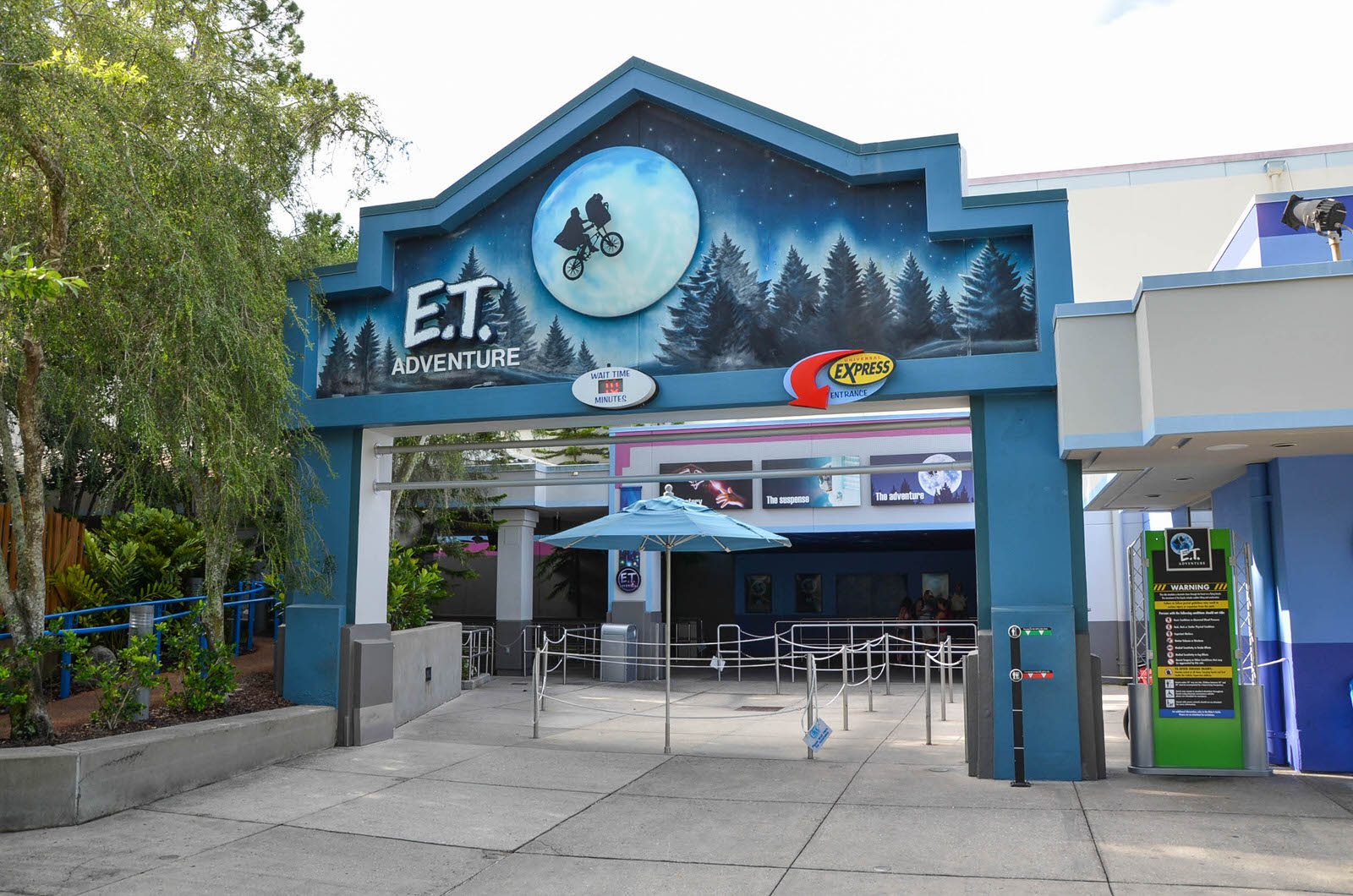
E.T. Adventure
So, let’s take a look at the only remaining attraction from the 1991 opening day of Universal Studios Florida: E.T. Adventure. It is charming, colourful, cute, and… aged. The animatronics are past their best, the story flows far less smoothly than we’re used to today, and overall, it feels closer to It’s a Small World than to the cutting-edge attractions that surround it.

But the magic in E.T. Adventure doesn’t need the shining finish of modern-day ride experiences; there are a handful of special moments throughout the attraction, and they’re really special. Special enough to keep a 30-year-old dark ride open alongside some of the greatest innovations in modern theme park design. Special enough that people fight its closure. Special enough to outlast every other opening day attraction.
The queue area is one of those special moments.
You don’t enter E.T. Adventure from a themed area of the park. Unlike The Wizarding World of Harry Potter, where every detail pulls you into immersion before you even get close to a ride, E.T. Adventure looks like a simple soundstage surrounded by pleasant, unobtrusive greenery. There’s nothing to start you on that emotional journey or set the tone before you enter the attraction, so it’s all up to the queue area.
There are four distinct sections to the queue: one is exterior, four are interior, and each is more heavily themed than the last.
The exterior section, which comes first, is fairly unremarkable. It blends comfortably into the low-intensity theming of the area to protect guests from any jarring shift in atmosphere or setting when stepping into the queue. Nearing the second section, the ceiling that shelters this exterior area transitions from plain white into a deep purple mural of the night sky, gently welcoming guests into the experience.
Guests are then invited into the first interior section: a small, mildly themed room in which the preshow is delivered. The preshow for E.T. Adventure comes in the form of a short video presented by director Steven Spielberg designed to introduce the attraction’s concept and mysterious, whimsical mood.
Only once guests have been acquainted with this mood are they moved into the third section of the queue area, which sees another increase in intensity of theming. Blue walls decorated with images from the movie are accompanied by an iconic John Williams soundtrack, encouraging guests further into the atmosphere laid out by E.T. Adventure’s designers. Without consciously realising it – but certainly feeling it – guests have been purposefully led into a sense of anticipation.
Finally, guests walk through a shadowy passage into the final section of the queue.
The music swells. Moonlight filters through the leaves. Trees surround you on all sides, towering so high above that you just have to look up and – the immersion breaks when the lighting rig hangs unconcealed overhead but then-
The smell.
The air carries the scent of pine trees, magnificent and powerful and forever ingrained into your memory of this attraction. You wander deeper into the midnight forest. You’ve been through countless queues today, queues that cost more money to design than you could even imagine, but not one of them has enchanted you like this. You always thought it was silly when people used magic to describe theme park rides, but as the trees pull you in, there’s no other word that fits.
By the time you board the ride vehicle, you’re ready to believe anything this ride tells you.

The Blueprint: Why Universal’s Queue Areas Work
E.T. Adventure’s distinct queue area sections make it easy to identify a blueprint and understand why the build-up in theming pulls guests in so effectively:
- Transition from the area of the park to the setting of the ride experience.
- Introduce the atmosphere.
- Push guests towards the atmosphere they’ve been introduced to.
- Now that guests have taken on board the mood, amplify it.
Applying this basic blueprint to modern queue areas, it becomes possible to reveal an underlying structure in even the most complex of queues. Although Harry Potter and the Forbidden Journey has two or three times as many sections as E.T. Adventure, the simple four-step pattern still fits:
- Guests enter the queue from outside, and after a brief interior section via the lockers, the colour scheme blends easily with the surrounding area of the park. The plant life is slowly decreased, and the setting of the ride begins to take over as guests approach step 2.
- Guests enter the interior of Hogwarts and are introduced the idea that they’re sneaking through the corridors. The colour scheme shifts into the browns used throughout the rest of the experience, beginning with the lightest shades and bringing in new colours gradually.
- The colour scheme is well-established and is used more strongly as the queue progresses. The light grows darker and draws guests further into the foreboding atmosphere.
- The lighting is at its darkest, and the colours are used in tandem to fully emphasise the sense of lurking danger and mischief. The mysterious, magical atmosphere that accompanies the beginning of the ride experience is most strongly incorporated into this final section.
It’s complex, each step transitioning seamlessly into the next, but through the lens of its history, the structure is unmistakeable. It isn’t magic; it’s great design.
Harry Potter and the Forbidden Journey, even a decade after its opening, is undoubtedly one of the greatest theme park attractions ever created. Its innovative technology, unique combination of dark ride and simulation, and powerful queue area continue to rival every major attraction opened since. But, most of all, Forbidden Journey is a testament to what can be achieved by learning from and building on the history of excellent design.


Leave a Reply